
Google UX Certification
Project #2: Improve the online-test taking experience for remote students
This project was the second project in the Google UX Design Certification Program. For this particular project, I had to focus on creating designs that were specifically geared for web devices (i.e., desktops, tablets, laptops, etc.).
With the rise of the pandemic and everyone being remote for their academics, I saw many of my peers struggling to perform to the best of their abilities on tests provided by online platforms and feeling overwhelmed due to the lack of support provided to them during examinations. As a result, for this project, I decided to create an online test-taking platform inspired by SNHU, which has one of the fastest growing online universities.
Proposed Solution
Examination Pages
Completion + Confirmation
Skills
UX Design
UX Research
Tools
Adobe XD


Due to the fact that a lot of pages were repetitive, I will not show them here, but feel free to take a look at the full prototype.
Process
To begin this project, I started off by conducting initial interviews with target users to gain a deeper understanding of the biggest pain points and current issues with online test-taking platforms. Once I had observed users in their test-taking environment, I was able to translate used what I had learned into insights to develop a platform that would be accessible to users and reduce the cognitive load and overwhelming feelings.
Through these interviews, I discovered the pain points that users normally experienced while taking tests online. These included:
- Not being able to see the amount of time left in the exam period in an easy manner
- Difficulty in keeping track of the number of questions answered without having to click through multiple pages or scroll a lot
- No easy way to contact professor/test administrator if have a question or any issues pertaining to the exam
- Lack of confirmation when it came to submitting exam
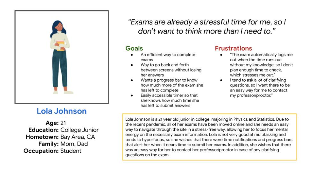
Personas

Initial Designs
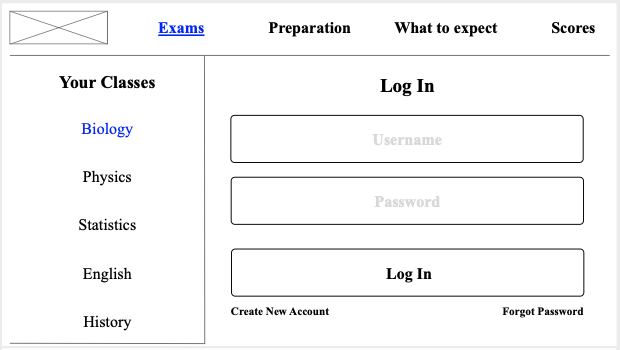
Once I had created personas, I began ideating and creating wireframes based on my findings from initial interviews. These were very rough and used during future usability studies to get feedback for future iterations.

Homepage
- Minimalistic style to prioritize relevant information
- Included articles to aid user in exam taking and act as more of an educational resource

Usability Studies
- Study Type: Unmoderated usability study
- Location: Bay Area, California
- Participants: 3 participants ranging from age 18-28, each completing the study individually
- Length: 15 minute study, based on a list of tasks that the user had to complete
These were the results:
- Users found it frustrating with having to repeat the class section process twice before getting to the exam and felt that selecting the main class should have been enough
- Users found it hard to see the amount of time they had left on the exam and were unable to see how many questions they answered before submitting
- User struggled with the lack of confirmation before submitting and were worried that they would accidentally press submit without finishing the exam
Accessibility Considerations
- Included captions on all images so that users with learning/cognitive disabilities can navigate the app in an easy manner
- Used high contrast to make the app easier for those with vision impairments
- Included icons that represent the classes visually so that those with reading disabilities can follow along and find their class in an easy manner
Reflection
Since I have a little bit of experience with taking tests online due to the Covid-19 pandemic, I had an idea of what I would have wanted in an online test-taking site. However, I knew that my needs would be different from other users of a test-taking site and had to learn to put aside my own biases in order to create a website that would be accessible to a wide variety of users.
Throughout the design process, I found myself having to consult with potential users of my site in the forms of interviews and usability studies to make sure that I was clearly addressing the main pain points of the user through my design choices and making it as accessible as I could so that it would have the most positive impact. In addition to consulting with users, I also realized that feedback is extremely beneficial, as it highlights where the design is lacking and needs improvement, and places the user's needs at the forefront instead of my assumptions.
Moving forward with this, I would like to see how this website improves the lives of students in online universities by performing live usability studies and interviews. This would allow me to see the impact that this website has on current students and allow me to figure out where to improve the site as the world of online test-taking changes.