
Google UX Certification
Project #3: Design a job search platform for recent college graduates
This project was the third project in the Google UX Design Certification Program. For this particular project, I had to focus on creating a product for social good that was responsive across both mobile and web devices.
Around the time of this project, I was in the midst of searching for jobs and noticed that the current job search platforms I was using were not providing me the most accurate results. This made the overall process more stressful and much more of a hassle, so for the purpose of this project, I chose to focus on creating a unified platform that made it easier for recent graduates searching for jobs to find and keep track of jobs and applications.
Proposed Solution

Skills
UX Design
UX Research
Responsive Web Design
Tools
Adobe XD
Find Jobs


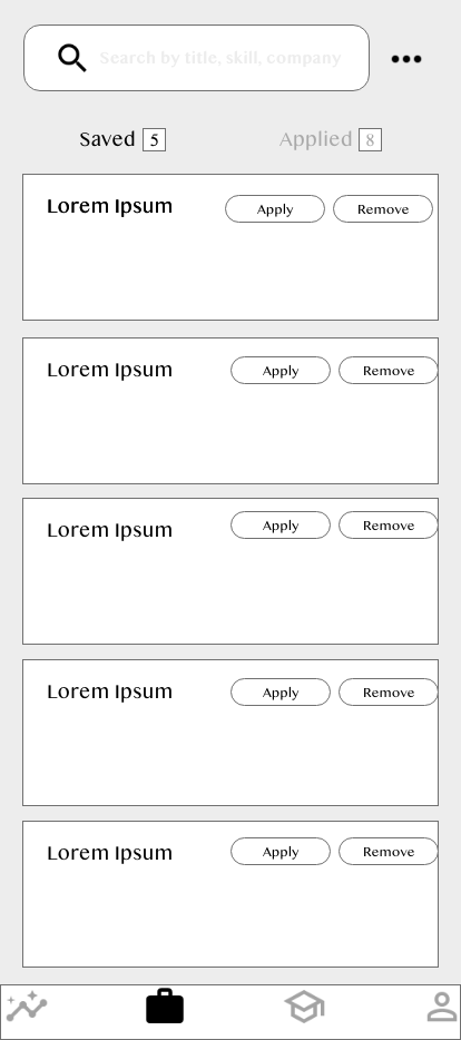
View Saved + Applied Jobs


Based on what I heard from interviewers, for the purpose of this project, I chose to focus on the search process and a streamlined way to view saved and applied jobs. I wanted to make the design as simple and minimalistic as possible, while still maintaining a similar design to the usual job platforms, such as Linkedin and Indeed.
Process
To begin this project, I started off by conducting initial interviews with recent college graduates looking for their first job in order to understand what sites they currently were using and their overall experiences with them.
Since the target users were solely limited to recent college graduates looking for their first jobs, I was able to utilize my findings of the target users and then begin ideating on some designs for feedback.
Personas


Initial Designs
Once I had created personas, I began ideating and creating wireframes based on my findings from initial interviews. These were very rough and used to get feedback for future iterations and understand validity of product.


Feedback
- Navigation is slightly confusing as there are too many clicks required to go between pages
- Have to scroll a lot to access relevant information for jobs; consider streamlining the page to make it more efficient and accessible
- Too many words on page; is there any way to make it more visual or engaging?
Reflection
This was the final project in the Grow with Google UX Design Certification program and challenged me with combining what I had learned throughout the program to design a product that was responsive across both web and mobile devices and tackled a challenge for social good. The most challenging part of this project was trying to figure out how translate the design from web to mobile, as most job seekers do not use their phones to search for jobs unless they are keeping track of the status of an application. As a result, I had to be innovative and chose to keep the design of the phone very minimalistic with less features as compared to the design of the web.
If I had more time, I would like to conduct usability testing to gain live user feedback and iterate upon the design to make Magic Apply the job search platform the most user friendly and accessible, as per the user's needs.