Google UX Certification
Project #1: Improve ordering at coffee shops
As a Cognitive Science graduate in 2020 with a foundation in research methodologies and a knowledge in how to collaborate with users throughout the development process, I was excited to enroll in the Google UX Design Certification Program. This program, built up of 7 online courses teaches how UX is utilized in an industry setting to create products that are both user friendly but also feasible from a company standpoint and drive revenue.
For this first project, I chose to design an app for a local coffee shop that would help users customize their mobile orders in a more efficient, streamlined way.
Proposed Solution
Menu Pages
Skills
UX Design
UX Research
Tools
Figma
Customizing Order
Checkout
Process
To begin this project, I first conducted research on popular existing coffee shops, such as Starbucks and Blue Bottle to figure out the pain points with mobile ordering and better understand what users were looking for.
Checkout
VS
After conducting research and testing out the apps, I decided to focus my efforts on designing an app that would target people with dietary restrictions. While Starbucks and Blue Bottle have these options available to choose from on their apps, they were much more difficult to find if you didn't know where to look on the app or were not in a physical store.
Personas
Ordering
Wireframes
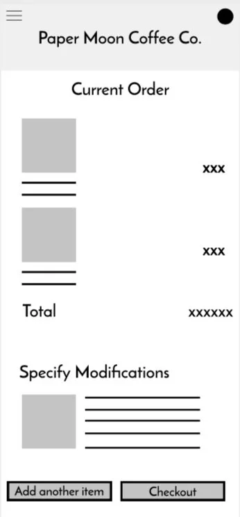
Once I had a deeper understanding of my target audience, I was able to start ideating and creating wireframes that I could show to my peers and get feedback. These wireframes closely resembled the Starbucks and Blue Bottle apps as those are what people are used to seeing, but I improved on them by making the dietary information more prominent as well as streamlining the modification process for those with dietary restrictions.
Main Menu
Feedback
- Too many clicks to find important information
- No way to navigate back to original page, which can be overwhelming
- Need a clearer navigation bar
- Improve UI (i.e., button sizes, proximity of items on page) so that it is legible and user friendly
Reflection
Through this project, I was able to gain a deeper understanding of how to translate a variety of user insights into actionable items that could be used to develop a product that was both user friendly, but also viable from a business perspective.
One of the most challenging things about this project was not being able to physically interview people and get adequate feedback due to the Covid-19 Pandemic and the program being entirely asynchronous. As a result, if I had more time, I would have liked to present my idea to a few local coffee shops to see if the idea had validity and would be used by frequent cafe visitors.


