
Dexterity Intranet
Redesign
Brief
Dexterity is a robotics startup that builds intelligent automation systems for warehouse and logistics operations. As the company grew, employees struggled to find essential information due to a fragmented and outdated intranet. To solve this, the goal was to design a centralized, easy-to-use knowledge hub that reduced reliance on HR and empowered teams to access accurate, up-to-date resources on their own.
A new intranet landing experience that centralizes resources, streamlines navigation, and empowers employees to self-serve with confidence.
I partnered with a fellow colleagues Blake Dy, Jordan Rothe, Emilie Peck, and Diane Prins-Sheldahl to reimagine Dexterity’s intranet experience. We focused on making critical information easy to find, reducing reliance on HR, and streamlining access to tools and resources. I led the design of a centralized landing page that empowered employees to self-serve with clarity and confidence.

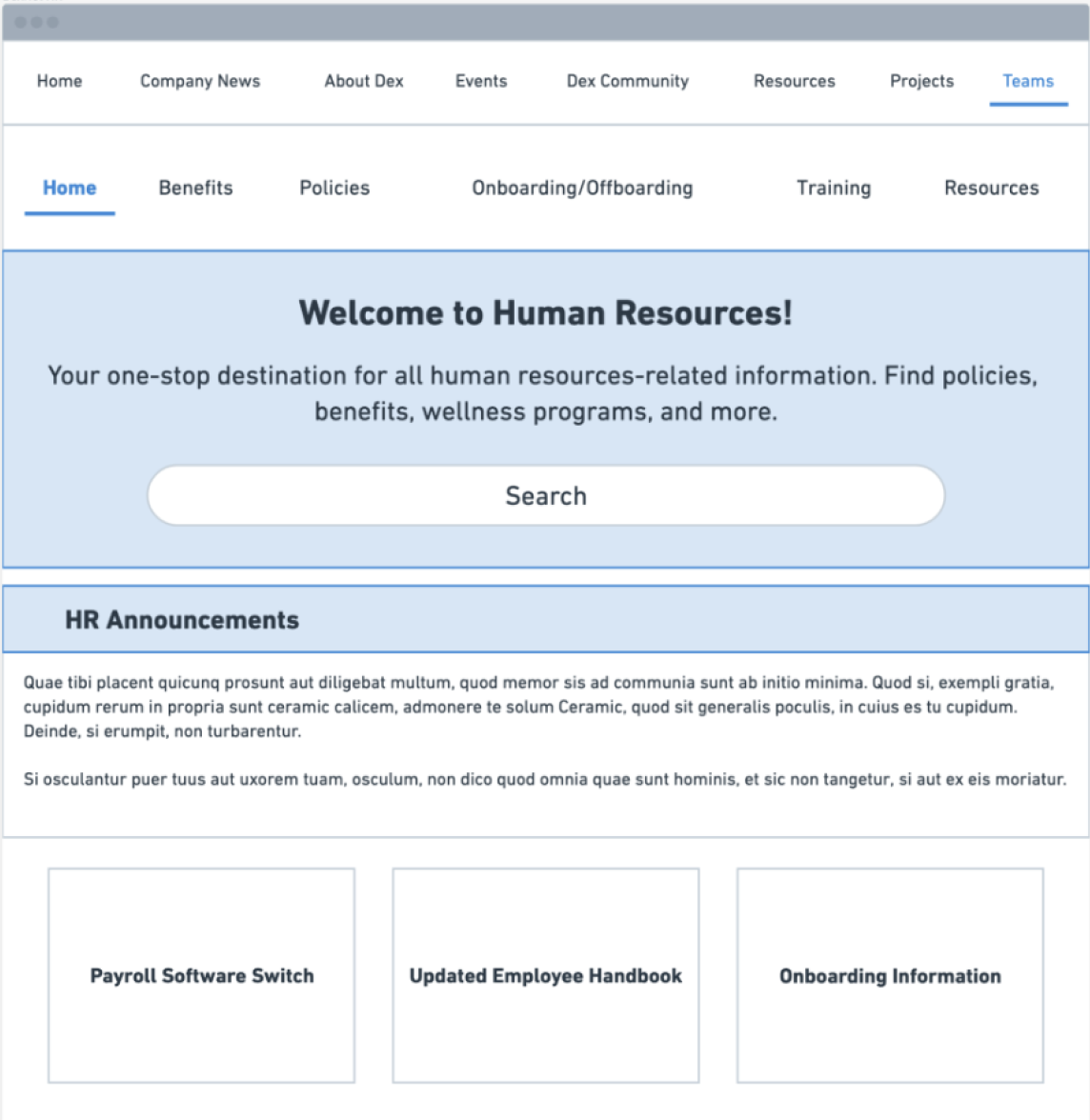
Making It Easier to Navigate Teams and Find Support
To reduce confusion and help employees find the right information faster, we designed a team directory and resource hubs that bring clarity and structure to department-level content. Whether someone is looking for HR policies, onboarding help, or simply trying to reach the right team, these pages make it easier to search, explore, and connect with the support they need.

Current Journey
Raga just joined the company and logs into the intranet, hoping to get oriented and find what she needs for her first week. Within minutes, she feels disoriented—nothing is where she thought it would be, and the homepage doesn’t help her figure out where to start. She tries the search bar, but the results lead to outdated docs and scattered pages across unfamiliar tools.
She clicks through multiple links, trying to connect the dots on her own, but it only makes her more confused. Eventually, Raga reaches out to HR, feeling a little embarrassed for asking yet again. Even after getting help, she still double-checks the information—afraid of using the wrong resource and making a mistake.
What should have been a confident first step turns into a frustrating maze, leaving Raga disconnected and unsure if the system is really built to support her.
Realist Phase
The Realist phase was all about grounding ideas in practicality. After dreaming big, we brought our concepts back down to earth by focusing on what would actually work within the company’s current systems and needs. This stage helped us distill feedback into clear, tangible next steps—rooted in real user pain points and actionable priorities.
Designing a Homebase That Informs, Engages, and Empowers
One of our core goals was to create a homepage that surfaces the most relevant and engaging content for the community. This section highlights what’s trending across the company—featuring the most viewed, liked, and shared updates to keep everyone informed, connected, and part of the conversation.

Reasons for not using Intranet

What’s Everyone Working On?
We designed a centralized project dashboard to help employees explore what’s happening across the company, track their own active tasks, and discover opportunities for collaboration. By making work more visible and connected, this space fosters transparency, focus, and a stronger sense of shared progress.
The Process
"Employees spend an estimated 28% of the workweek managing email and nearly 20% looking for internal information or tracking down colleagues who can help with specific tasks. When companies make use of internal social channels, this time searching for information can be reduced by as much as 35%."
They spend 3.6 hours daily searching for information
Document-related issues are responsible for over 21% of organizational productivity loss
82% of employees report that poor information management negatively affects their productivity
Outdated content leads to mistrust and makes the intranet unusable.
Resources are scattered across platforms with no central source of truth.
A confusing layout and lack of structure make self-service nearly impossible.
To keep employees engaged and reduce frustration, the intranet needed to feel relevant, easy to navigate, and tailored to individual needs. I focused on designing a centralized system that surfaces the right information at the right time—without overwhelming users or forcing them to rely on others. The goal was to build a platform people trust, return to, and genuinely find useful in their day-to-day work.
Uncovering Trends


To design a more effective system, I first needed to understand how the existing intranet had evolved—and how employees were (or weren’t) using it. By uncovering historical trends in engagement, content usage, and tool preferences, I identified key patterns and pain points that shaped the foundation for a more intuitive, centralized experience.
Applicable to all employees
Raga

Ideation: Disney Creative Sprint
To reimagine a fragmented and uninspiring intranet, I turned to the magic of Disney—where clarity, emotion, and storytelling drive every experience. This creative sprint helped me explore how whimsical design, intuitive structure, and purposeful content could turn a frustrating system into one employees actually want to use. It was about transforming confusion into delight, and clicks into confidence.
Dreamer Phase
In the Dreamer Phase, I explored bold, imaginative ideas to reimagine what the intranet could be—without constraints. This was a space for blue-sky thinking, rooted in storytelling, emotion, and the kind of magic that makes people actually want to engage. Inspired by Disney’s belief in wonder and purpose, this phase asked: What if the intranet felt like an experience worth coming back to?


Information Architecture
The information architecture started as an exploratory framework to help us define what belonged where and why. Early wireframes revealed overlap—like “popular” content appearing on multiple pages—so we refined the structure to make each section feel intentional. This framework also guided simplification, turning complex flows like email customization into more digestible, user-friendly steps.