
Chakravue AI Imaging Platform UI Redesign
Used context engineering to redesign an eye and dental clinic imaging platform, translating clinical workflows and user needs into a clearer UI for faster, more confident diagnostic decisions.
Project Context
This project involved redesigning an existing AI-assisted camera imaging platform for an eye and dental clinic. The platform enabled users to upload clinical images and receive analysis-driven insights to support doctors and the clinic team in reviewing patient cases. My focus was on improving the clarity, structure, and usability of the interface so that clinical users could more easily understand imaging results and move through the diagnostic workflow with confidence.
Prior UI
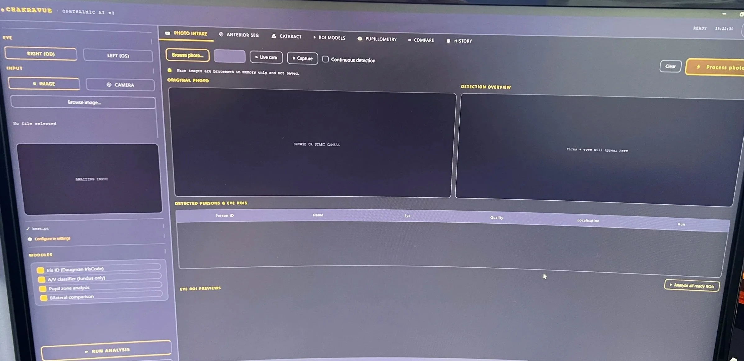
Image shown above is a screenshot captured while talking to the client
Analysis
While the existing UI had a strong technical foundation and supported the necessary functionality, the overall look and feel felt bland, static, and visually undifferentiated. The client saw himself as a disruptor in the medical AI space and wanted the platform to reflect that ambition through a design that did not simply follow existing healthcare software trends. He envisioned a more distinctive interface with an Indian-inspired visual identity, something bold, culturally rooted, and unlike anything currently seen in the market.
Design Direction
As part of the redesign process, I used Claude as an AI-assisted design partner to help translate the client’s abstract goal of “disruption” into a clearer visual direction. I prompted Claude with the project context, the existing UI, the client’s desire for an Indian-inspired identity, and the need for the platform to still feel trustworthy in a clinical setting. From there, I used Claude to explore possible design directions, compare different interface personalities, refine the “Indian sleek JARVIS” concept, and think through how the product could feel more like an intelligent AI command center rather than a standard medical dashboard.
Claude helped me break down the visual qualities I wanted the redesign to communicate: futuristic, precise, responsive, culturally distinct, and clinically credible. I used it to generate language around the design direction, identify areas where the original UI felt too generic or static, and brainstorm ways to make the interface feel more polished through hierarchy, contrast, spacing, color, and layout structure.
The final design decisions were still guided by my own judgment as a designer. I evaluated Claude’s suggestions, filtered out ideas that felt too gimmicky or unrealistic for a medical product, and translated the strongest concepts into a visual system that balanced three priorities: AI intelligence, clinical trust, and Indian visual character.
Final UI
